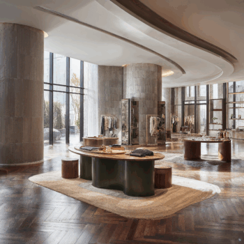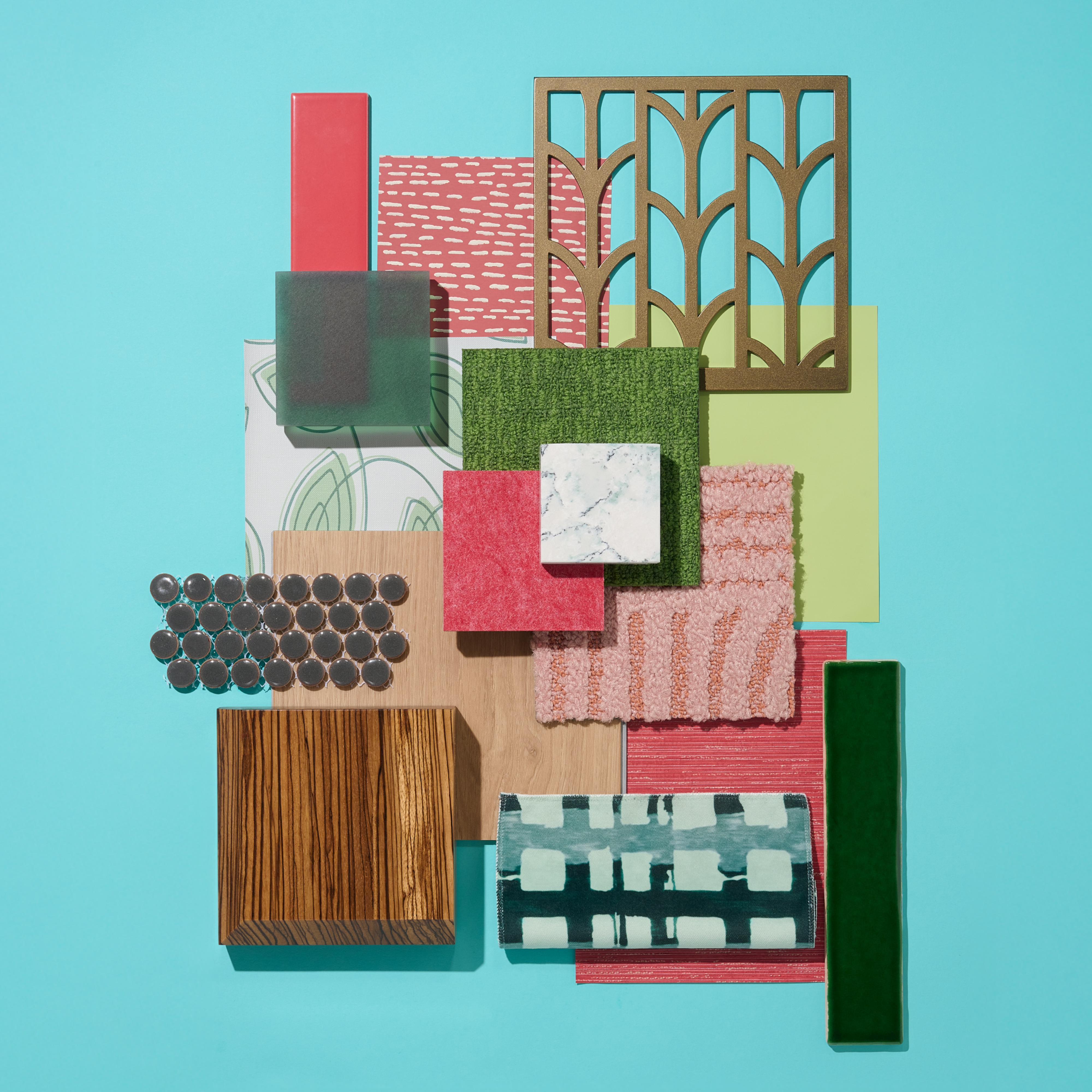
Nothing says summer quite like the crisp contrast of watermelon—its juicy red flesh and deep green rind a visual signature of the season. Summer Contrast captures that essence with bold color play, tactile variety, and a mix of materials that feel sun-soaked and design-forward.
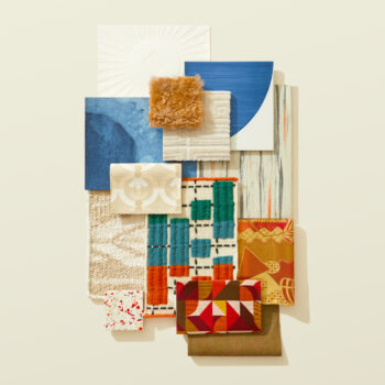
Watermelon-colored ceramic tile offers the starting point—vibrant, refreshing, and instantly recognizable. Paired with a rich green resin and grid-patterned upholstery, the palette builds rhythm and structure into the scheme while nodding to natural form and function.
A textured wallcovering adds a layer of softness, balancing the visual energy with dimension and tactility. Dark green modular carpet grounds the look, while warm wood-look LVT brings a neutral anchor—mirroring the seeds and rind of its namesake with understated charm.
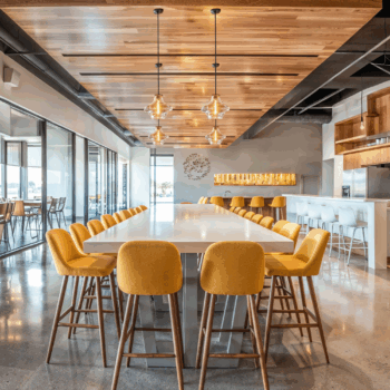
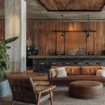
Summer Contrast is playful yet poised, nostalgic yet new. Whether applied in retail, hospitality, or residential environments, this story evokes seasonal warmth and visual appetite, all through color combinations that feel both timeless and unexpected. Together, these elements form a palette that balances structure and delight—channeling the natural geometry, vibrant color, and layered texture that bring dynamic contrast to interior spaces.
Looking for more Summertime design inspiration? Check out our article on Modern Outdoor Patios.


