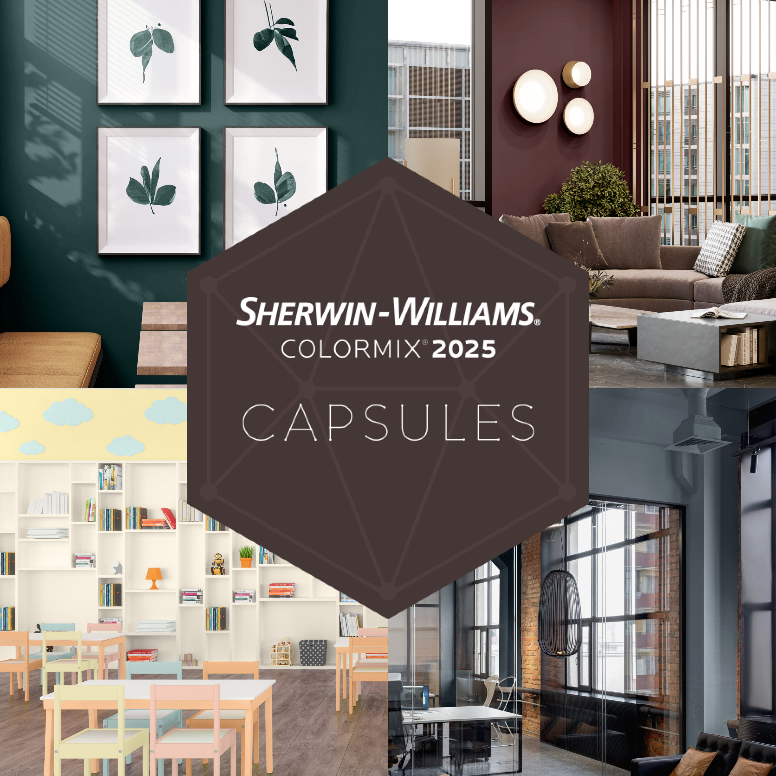
Color has a significant impact on how one navigates through the world. It affects your mood, behavior, perception of space, and productivity. In commercial landscapes, such as healthcare, workplace, and hospitality, these visual cues create an optimized environment for tenants, workers, and visitors. Sue Wadden, Sherwin-Williams’ Director of Color Marketing, and the Global Trendsighting team have curated four capsules — Chrysalis, Paradox, Wellspring, and Kindred — consisting of 48 expertly selected colors to help you design the space of your dreams. With so many hues to choose from, finding the right shade for your project is a snap!
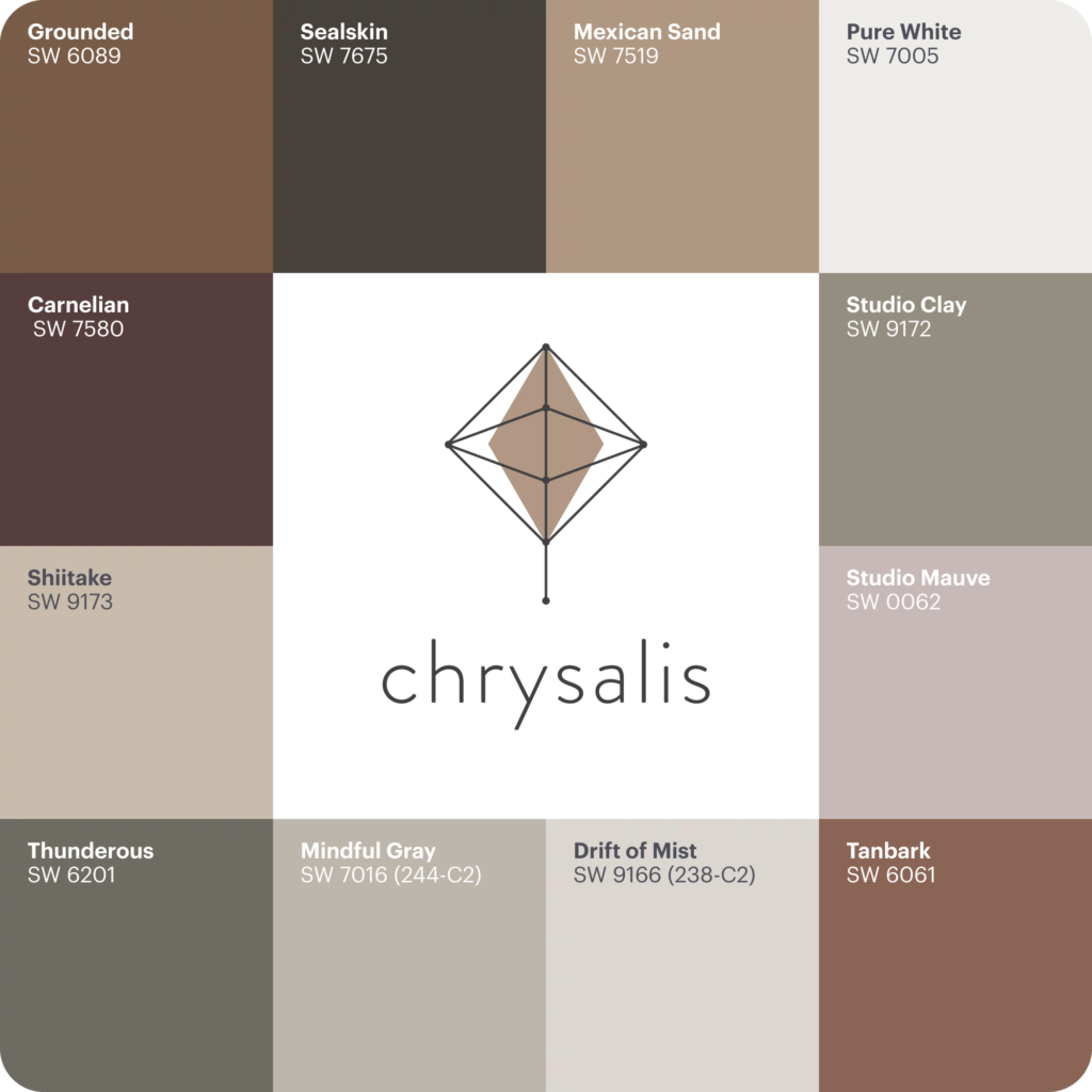
Chrysalis draws on sustainable materials, sophisticated color palettes, and earthen textures inspired by wood tones, sifting sands, and freshly turned earth. This palette brings to life the raw and subtle beauty of nature.
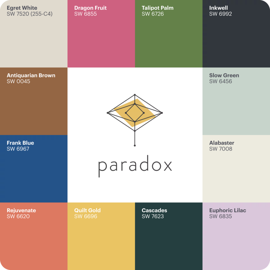
Paradox captures excitement and whimsy with a twist on tradition in this bold capsule. In commercial spaces where fun serves a functional purpose these colors surprise and delight by offering an engaging sense of energy.
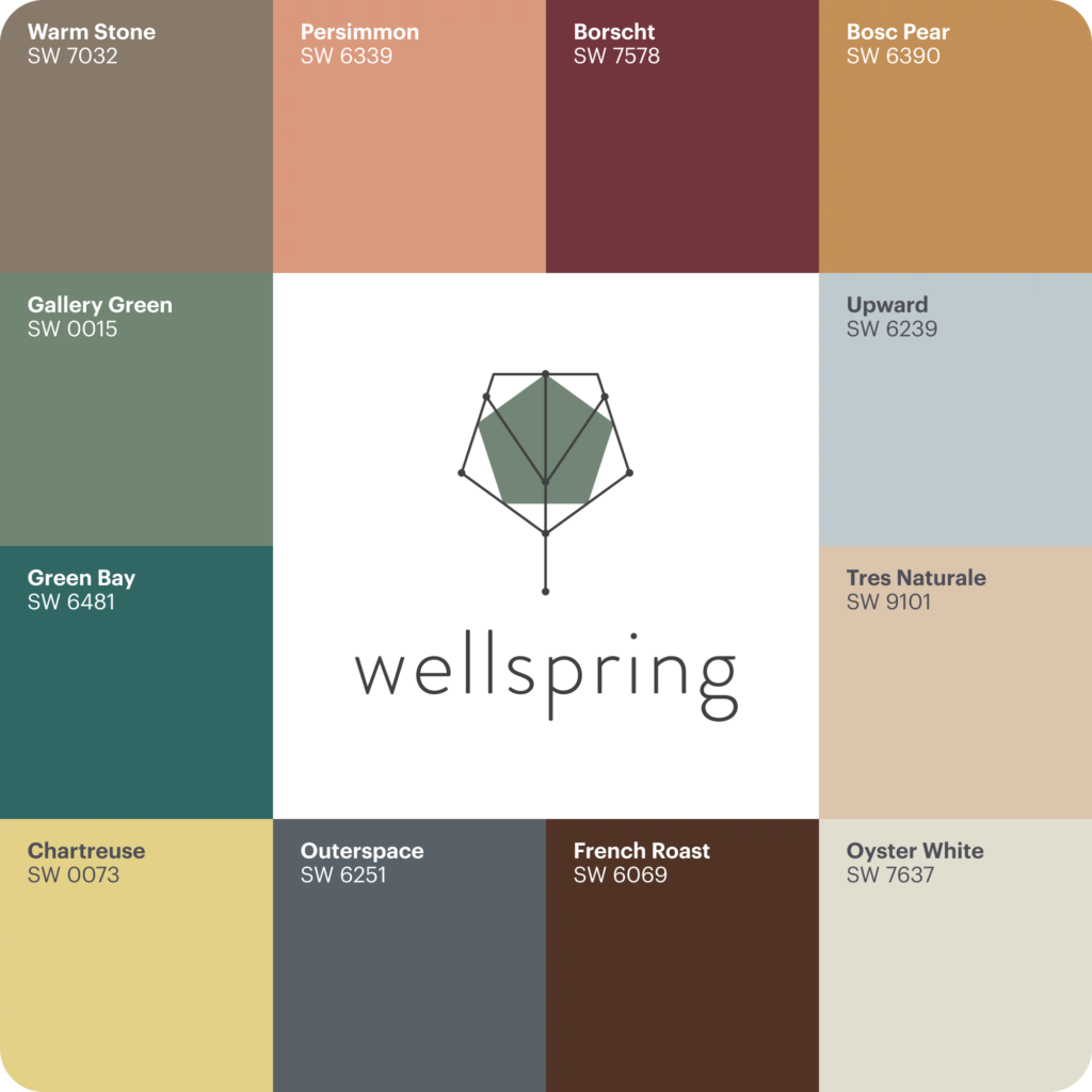
Wellspring is an homage to timeless artistic vision and wisdom. By connecting with a shared heritage, it helps reinvigorate one’s design with fresh perspective creating environments that enhance a sense of identity, encourage participation and presence, and foster emotional connections.
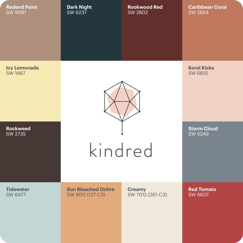
Kindred is a collection of warm-hearted colors enriched by open-mindedness and inclusivity, with a focus on crafting deeply useful experiences for all. Celebrate uniqueness by tailoring your colors to the project’s interactions, physical space, and lighting.
Explore all 48 shades of Sherwin-Williams Colormix® 2025 Capsule on Material Bank.
Can’t get enough color? Read more here about how to make a bold impression in your office space with neon colors.


